

Brew of Shadows
Craft Beer | Salem, MA
Branding, Package Design, Print Marketing,
and Print Collateral
Brew of Shadows is a fictitious craft brewery located in Salem, Massachusetts, specializing in dark-style beers. To pay homage to their chosen specialty and the history of Salem, they chose to lean into the witchcraft and occult iconography that is often associated with their location. As a company, they were on the precipice of a regional roll-out to finer grocery stores. They were also looking to elevate the brand to appeal to a more upscale consumer base while not losing the connection to their dark roots.
The scope of the project was to design the retail packaging for the first two brews to hit the market. To drive interest, they also requested print marketing for regional publications and marketing collateral for their taproom
and upcoming festivals.
The Process
The Discovery process started with defining the target audience: single (or young married) males and females, ages 30+, with a large amount of disposable income. This group has an appreciation for the finer things in life. They enjoy trying out new gourmet products, and wouldn’t hesitate to put something in their cart based on great packaging. They like to entertain and throw cocktail parties. They watch the Food Network and read Everyday Food magazine. They believe food = fashion.
My client’s aesthetic didn’t immediately match the desired target audience, so I chose to approach the design problem from the attitude of how can we attract this demographic to the product. I decided to lean into intrigue and mystery with a bit of fashion = danger thrown in.
Two directions developed early on, both seeking to add mystery to the after-work beer experience.

Concept One: Illustrative occult iconography and parchment

Concept Two: Playing with shadows and striking photography

Concept Sketching
A direction emerges.
Exploration during sketching led to typography being the main focus in establishing the brand's identity. It also, quickly became clear, that a melding of the two concepts was where the project was headed. During my research of occult iconography, I came across the alchemical symbol for the philosopher's stone, which is a mythic substance that turns ordinary metals into gold. I also learned that it symbolizes perfection and heavenly bliss. I knew that this direction would resonate with the client, as they strive daily to seek the perfect alchemical formula (hops + water + time + a little bit of magic) that culminates in a great craft beer.

Round One Label Designs

Round One Label Designs
Round One Design
This round brings together pieces from each direction. The alchemical symbol comes from the occult iconography concept. I paired it with striking black and white photography. Using Aviano, a serif typeface that exudes power and luxury, balanced with Gravesend Sans, a clean but sometimes delicate sans serif highlights the duality of the brand as they attempt to expand their customer base while keeping their edgy nature.

The revision rounds incorporated feedback about cleaning up the icon as it lost clarity when used across differing backgrounds. It was also during revisions, that I developed secondary brand elements to be used in collateral for the tap house and for use at festivals and other public gatherings.
The Results.
The culmination of the project yields a clean, intriguing package design that stands out amongst it competitors on the crowded craft beer shelves. The use of striking photography provides a classy respite amongst the visual noise of the bright, busy labels of competitors.
Philosopher’s Stone - The flagship flavor of Brew of Shadows.

Philosopher’s Stone - Flat Label

The Witching Hour - Flat Label


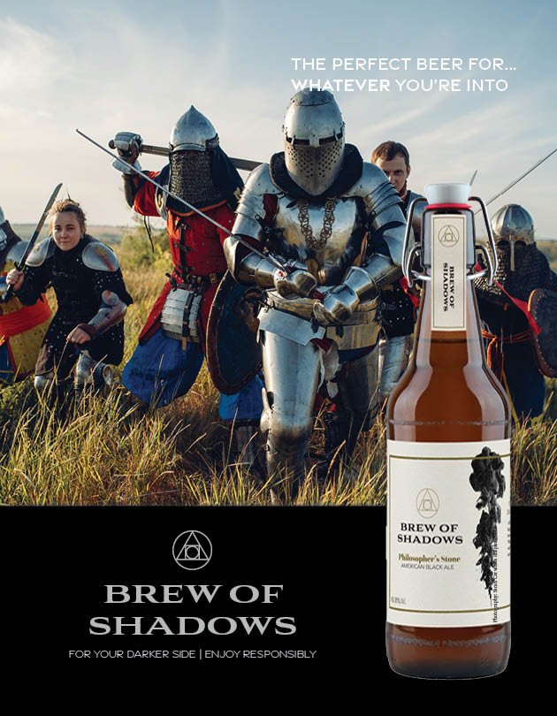
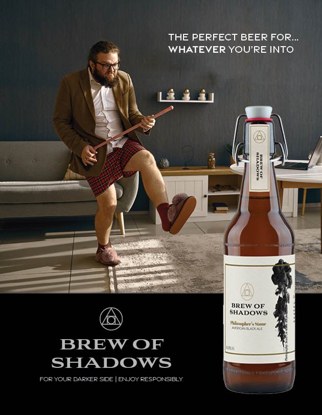
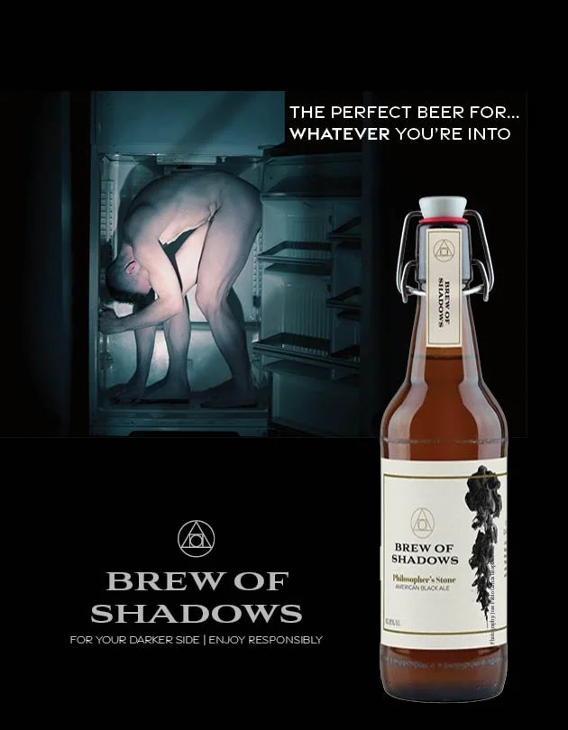
The marketing campaign for the rollout is about showcasing Brew of Shadows as the perfect beer for whatever you’re into - whether that be radical self-care, excelling at sports, or escapades in empty refrigerators. These ads continue the brand’s blending of photography and a bit of dark humor.


The Reflection.
This project taught me about the importance of being knowledgeable about regulatory elements that are required on certain packaging. It also taught me about the importance of tone, but also boldness in choices. While some of the imagery I chose might be a bit edgy, I felt that the brief demanded a certain boldness to truly convey the nature of the company. In future revisions, I would explore more flavors, expand photography options, and a social media campaign that ties into the print campaign.