

FinCon 2021
Financial Influencer Convention | Austin, TX
Print Design, Marketing Collateral
FinCon is an annual convention that is described as where money and media meet. Austin played host to one of the 2021 meetings. My task was to create print marketing materials for the event. The project was completed to fulfill requirements for a typography design class and further materials were completed to build the project out for this portfolio.
Process.
The Discovery process always starts with defining the target audience. The event is a digital marketing event that brings together content creators (YouTube, podcasts, blogs, etc) in the personal finance realm. The audience is mostly 18-40 and tech-savvy, with higher than average disposable income. The target audience is also diverse with regard to culture and gender.
The next step in any creative project is to take a look at what is out there in the personal finance sphere that may provide the necessary context for the design. It’s also the time to look for inspiration on layout and color palette.

Moodboard and Inspiration
The target audience is content creators who are well versed in developing ways to reach their target audience. I knew that the event poster would need to be eye-catching and stand out amongst the sea of trustworthy blue that permeates the finance world. I was immediately drawn to the layering of the CMYK colors and this made me think of the importance of printing and money.

Concept sketching explored ideas of using hashtags, the dollar sign, and the flames that represent the F.I.R.E. movement (financial independence retire early).
Digital Drafts.
Bringing the sketches into the digital sphere allowed me to fully explore the bright color palette and the various layouts explored with pencil and pen. These drafts were presented and the strongest concepts were taken further into the revision process.


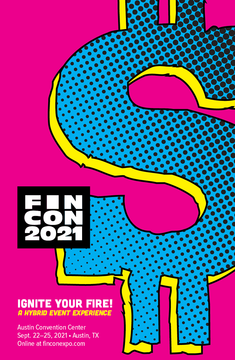
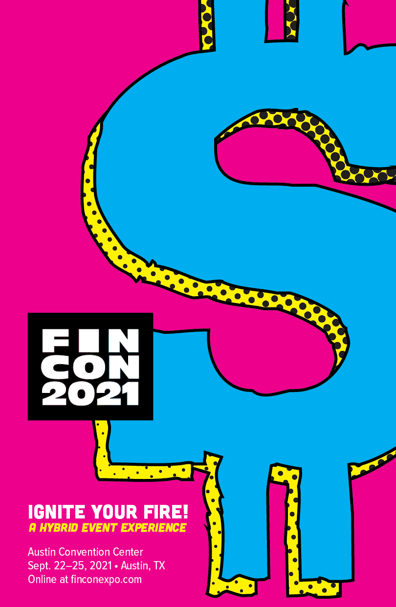
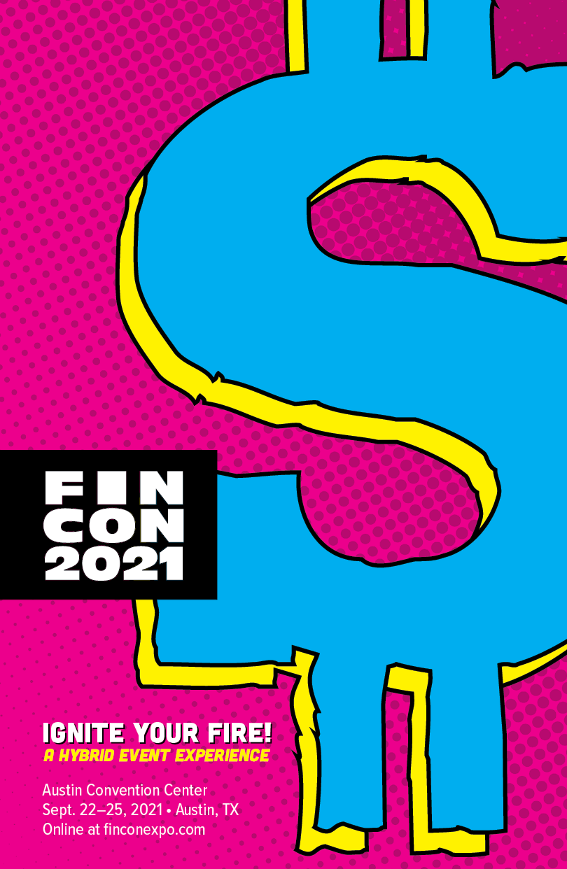
Digital Comps.
This round explored adding texture and working on several points that were brought to my attention during feedback sessions. There was some concern about clarity and fit with some earlier typography choices. The script typeface was determined to not be a good fit for this direction and the serif I had originally chosen has some readability issues. In later iterations, I decided to go with a cleaner, but poppy, sans serif across the board. I also explored adding some halftone texture to amp up the retro vibe of the work.
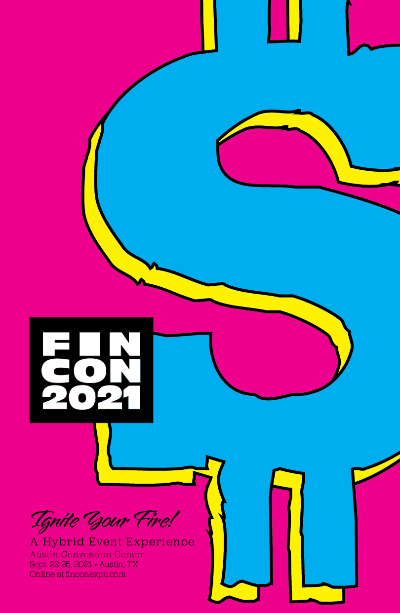


Results.
After several passes of refinement, the poster below is the final product. It catches the eye immediately with the bright, fully saturated colors and the large-scale dollar sign. The viewer knows that something fun and financially freeing is happening.

Event Poster

Money Nerds Unite!
Now that the look and feel had been established, I built out more collateral for the convention. Keeping with the retro feel, I chose to design the event ticket to look like an old-school credit card carbon receipt. The lanyards and badges incorporate the colors and textures from the poster.

Convention Admission Badges

Event Ticket

Reflection.
I loved working with the colors in this project. They do present some readability and contrast issues that I had to work through by adding black to the design in thoughtful areas. It was important to me to match the energy that these content creators bring to their passion by delivering a project that both reflects and fuels that. This project could be built out further into a social media campaign and branded assets for the convention-goers to use on their personal platforms.