

Creative Co-Labs
Brand Identity
Logo Design and Brand Standards
Creative Co-Labs is a new organization at Austin Community College. Its purpose is to nurture and facilitate collaboration between students and faculty across departments. As a new organization, Creative Co-labs was looking to establish a brand identity. Partnering with the Visual Communications Department at Austin Community College in the Spring of 2021, the process of developing a logo began.
The Process
Teams from the prior semester conducted discovery and presented the client with 3 distinct directions and passed the baton to our class in the fall semester. After meeting with the clients, gaining insight into what excites them about the organization and branding possibilities, and formulating the Creative Brief, we began the process of designing logo solutions.
Our team had three different directions or moods from which to work: kinetic, connected, and intersection. We knew that the clients were excited by futurism as expressed by creative planets aligning, a bold color palette, and the idea of the connection of people as expressed by transit maps. Our team developed a round of sketches around these ideas. We conducted an internal review within our team and another with our Creative Director / Professor to narrow down to three options to present to the clients at an upcoming meeting.
My title on the project was Project Manager, and I took the project from the initial handoff to the delivery of files to the client at the end. As Project Manager, my main responsibilities were to develop and maintain the schedule for the project, be the main point of contact with the clients, and provide support to the designers during the course of the project. In the early stages, all team members, including myself, developed ideas and drafts for consideration.

Concept Sketching
Sketching
My early exploration through sketching began with the idea of an event horizon (the theoretical boundary surrounding a black hole) and other space-related themes. This is the subject that excited the client when he was speaking about what he connected with from the directions that were presented to him by the prior class. He was looking for something that portrayed energy, and was not afraid of bold colors.
Digital Drafts.
Our team all provided drafts of our most successful sketches for internal review. During our multiple internal reviews prior to client presentation, we did a design remix where we worked on each other’s designs. to see if we could push the concept further.

Digital Drafts

Design Remix

Beyond the Boundary, Perpetual Convergence, Making Connections
Round One.
Our team presented three ideas to the clients. The first, Making Connections (Tracie Louck), is a solution that incorporates the idea of a transit map with cyan and magenta as a reference to creative work. It speaks to the creative journey and the gathering of new ideas at the stops along the path. The second, Beyond The Boundary (Luis Filipe Borges), pairs clean sans serif typography with a cool color palette. The dark blue segments imbue the design with a sense of momentum meant to reflect forward progress on creative projects. Having the typography break the plane of the circle speaks to the boundary-breaking nature of Creative Co-Labs. Our third solution, Perpetual Convergence (Karly Lussier), really speaks to the idea of futurism that our clients expressed excitement over. Combining an orbital reflects how Creative Co-labs encapsulates a variety of different departments and creative fields. The stylized infinity symbol speaks to the infinite possibilities found in the collaboration of ideas and talents.

Revisions for Round Two
Round Two.
After, the round one presentations the client asked to see three solutions from our class refined. Beyond The Boundary and Perpetual Convergence from our team and one from the other team in our class. Since their choices spanned two groups, we formed a smaller team of three to work on the requested alterations. I remained at the helm as Project Manager with Karly Lussier and Paul Freisenhahn joining us as a designer. We incorporated the clients’ feedback and requests to see different lockups and alternatives. We presented the client with three refined solutions, coupled with three from the other class, and awaited their final choice.
The Results.
Our class’s design was chosen as the final solution. We developed and presented the clients with a complete brand standards guide to ensure that their chosen logo always looks professional and in line with their chosen identity. I also created some basic signage for use outside of class and conference rooms while collaboration is in progress.

Final Logo
The design chosen by the client was the lockup above, by Paul F.
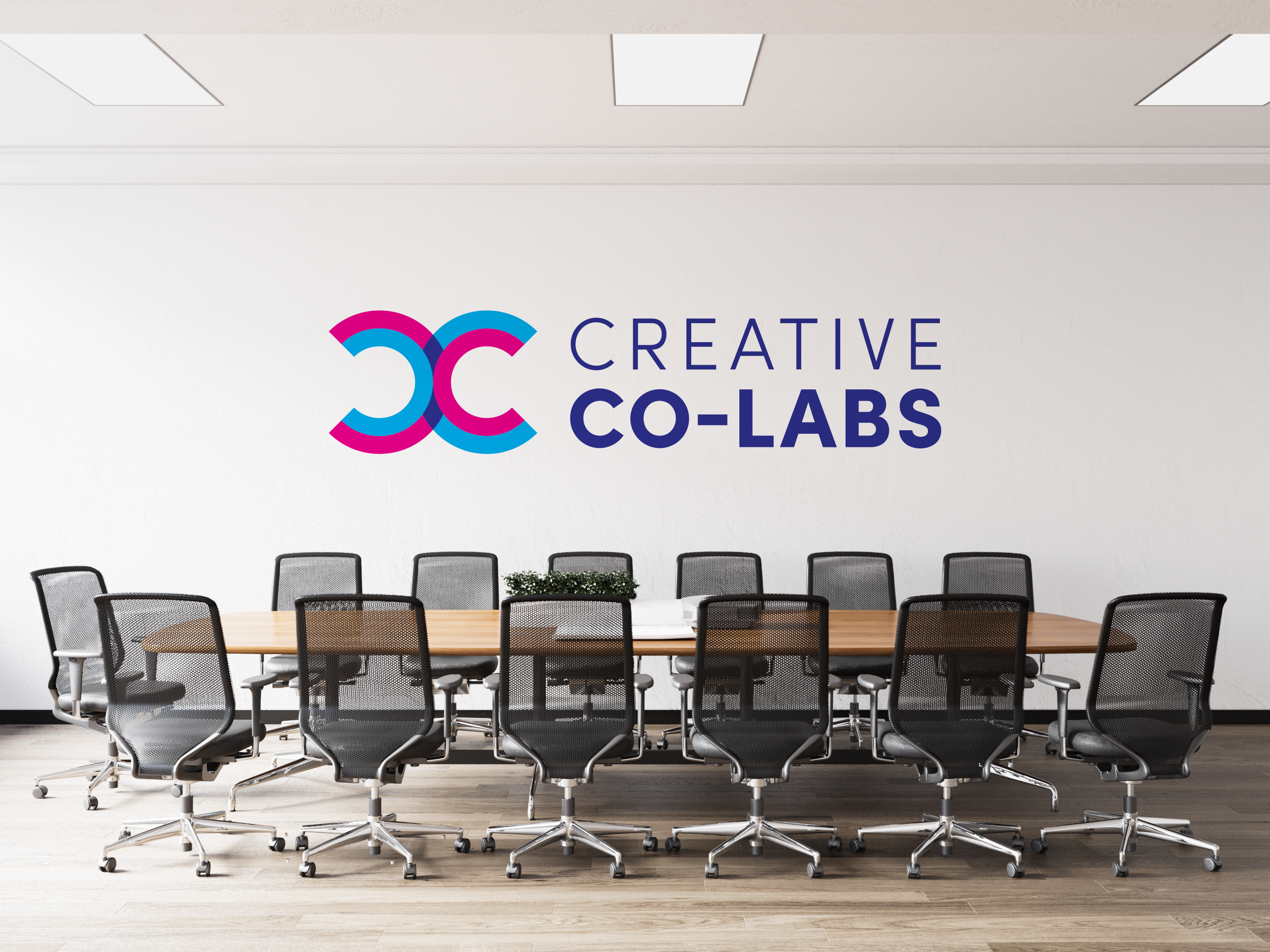
Wall Decal
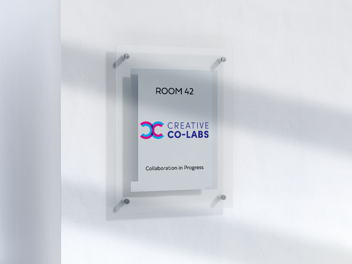
Door Signage
The Reflection.
This was a wonderful project and provided many learning opportunities. My role as Project Manager played to my strengths and past experience as a business leader in the Service Industry. Everyone on the team played an integral part in the project and played that part well. The hardest part was that we were picking up the project in the middle as the original discovery and background work had been completed months prior. We had to establish rapport with the client while also trying to understand where the last design team was coming from and start ideation quickly. Meeting with the client and getting to physically see what excited them and finding nuggets of inspiration from the phrases they said in the conversation was the key to this whole process. Presenting the client with a solution to their design problem that reflects their excitement about their organization is a great feeling.