

AFramed
Branding for a Luxury Glampground
Logo Design, Brand Standards
Aframed is a short-term rental glampground located outside of Austin, TX. It features several different types of glamping structures (a-frame cabins, safari tents, teepees) and areas for more traditional tent camping. It offers a luxurious experience in nature that includes a community fire pit, bathhouses, lots of fresh air, and sunshine.
This project was completed to fulfill requirements for a design communication class during the pursuit of my degree. The challenge was to assist with naming the company and to develop a brand identity system for the company.
The Process
The Discovery process began with asking questions of the client to determine how they see their business and determine what the business’s values are. This helps with determining a direction to take with the design. The answers revealed that the business valued friendliness, dependability, and hospitality as core principles.
I conducted competitive research on similar businesses both in Texas and nationally to see what design solutions had already been explored.

Moodboard and Inspiration
Prior to sketching, I took to the internet to look for glamping inspiration. Since the company had not been named at this point, the sketches will explore different names to present to the client.

Concept Sketching
During the sketching phase of the project, I explored pictorial, type-based, and abstract concepts. I was guided by the shapes I saw in the photos from the moldboard - there were lots of triangles. I took the sketches onto the computer and proceeded to develop many iterations.

Round One.
The triangle shape quickly became the main focus of my design. The simple silhouette of the shape of a tent against the setting sun was the idea I was I was trying to portray. The three lockups on the bottom right were presented for consideration.
Revisions.
After receiving feedback about the design, I returned to the computer for some rounds of revisions. Some issues I was working to fix were finding a typeface that better fits the nature and values of the business. The small triangle wasn’t reading clearly as a tent flap and needed more development.
I also received feedback the color palette was too rich wasn’t conjuring images of the outdoors. I headed into revisions with these changes in mind.

Round Two Iterations
Round Two.
I worked on different ways to incorporate the triangle as a design element. I also worked on a set that makes the tent shape more apparent. I explored typefaces that better represent nature and camping.
The Results.
The final logo provides a much more elegant solution than the one presented in round one. The typeface, Colt, is structurally strong and provides a solid platform for the logomark, much like a tent is supported by the ground. Avant Garde ITC is a clean, round sans serif that provides needed contrast for the supplemental information in the lockup. Combining the burnt orange of a setting sun with the earthy brown makes for a friendly, approachable brand mark.

Final Logo Solution

Brand Standards Guide Cover
The brand standards guide lays out the acceptable usage guidelines for the logo and associated assets. For the guide, I developed rules for copy placement and explored how the brand could be used in practice. Using the negative space tent icon as a textural element in the guide helps establish it for use in other collateral, like the business cards below.
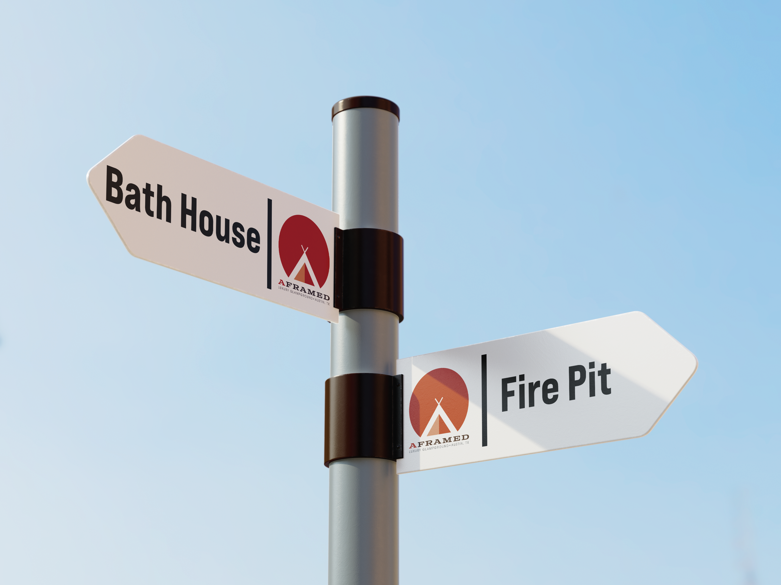
Way-finding - Amenities

Way-finding - Cabin Marker

Business Card

Merchandise - Keychain

The Reflection.
This project was a lesson in patience for me as it took me a bit of time to process the feedback I had received - which was mixed. I learned an important lesson about not getting too attached to any idea early on. It took branching out and playing with different shapes to finally arrive at a solution that I was both proud of and solved the design challenge presented in the brief.
Through the completion of this project, I learned the power of iteration - keep massaging it until you get there - and the power of stepping away for some time to let things marinate.
This project could further expand into designing an online booking site for the brand and bringing the design elements into the interior spaces of the glampground itself.