

Got Them Pretty Road Cases
25th Anniversary Collectors LP Set For American Rock Band Drive-By Truckers
Print Design, Layout, Book Design
Drive-By Truckers is an American rock band that celebrated their 25th anniversary in 2021. My challenge was to create a booklet celebrating their 25-year journey. This project was completed to fulfill requirements for a Design Communication class during my studies. I later expanded the project to include additional assets.
Process.
The Discovery process started as many others by defining the target audience. In this case, I was a member of a group that includes people who enjoy rock music, live music, whiskey, thoughtful songwriting, and general rambunctiousness. So, in this case, the discovery process began by digging out some old CDs and LPs and cranking the volume.

Moodboard and Inspiration
Since this was a typography heavy project, I spent most research time looking into options that spoke to my two needs. The first was something that is a bit rugged that reflects the nature of the music and the band’s established aesthetic. The second was a typeface that maintains readability with large amounts of body copy.

Concept Sketching
Concept Development.
During the sketching phase, I explored various different layouts for both the covers and interior spreads. I knew that I was going to create a booklet that would be appealing to audiophile fans of the band. To this goal, I chose 12x12 as the booklet dimensions so that it could sit alongside the other Drive-By Truckers albums in one’s collection. I also wanted to celebrate the LP as a unifying theme throughout the booklet.
I brought the sketches into the digital realm to produce the following spreads:


Revisions.
Based on the feedback received, I went back to fix some issues that were brought to my attention. The title’s position on the cover was fighting for attention with the photo. I also adjusted the color palette because it was reading as horror instead of rock n roll. The color palette overall was simplified to clarify the hierarchy of the interior spreads.
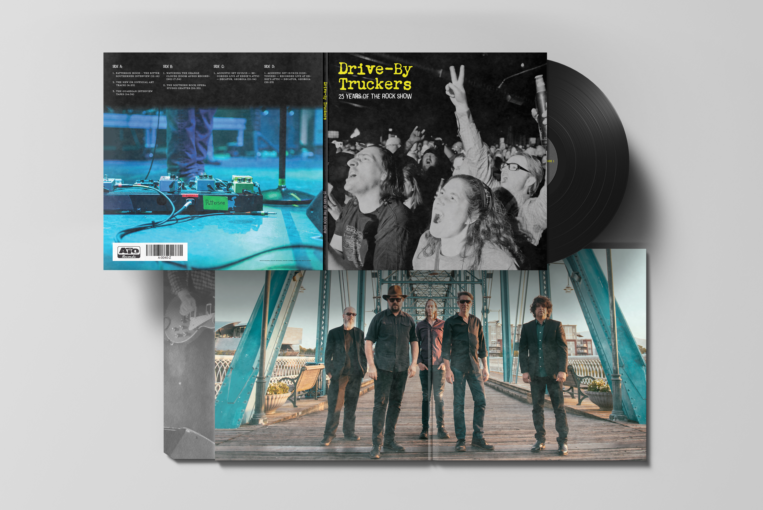
During this phase, I also expanded the project to include a special edition LP that now acts as packaging for the booklet. Continuing the use of photography that captures the live experience, I designed the album cover, the album interior, and LP envelopes to complete the set.
The Results.
The final design produced a fun piece of memorabilia that I would be proud to include amongst my other Drive-By Truckers albums in my record collection. The information contained in the booklet is presented in an organized fashion and rules were developed for how to handle different categories of information.
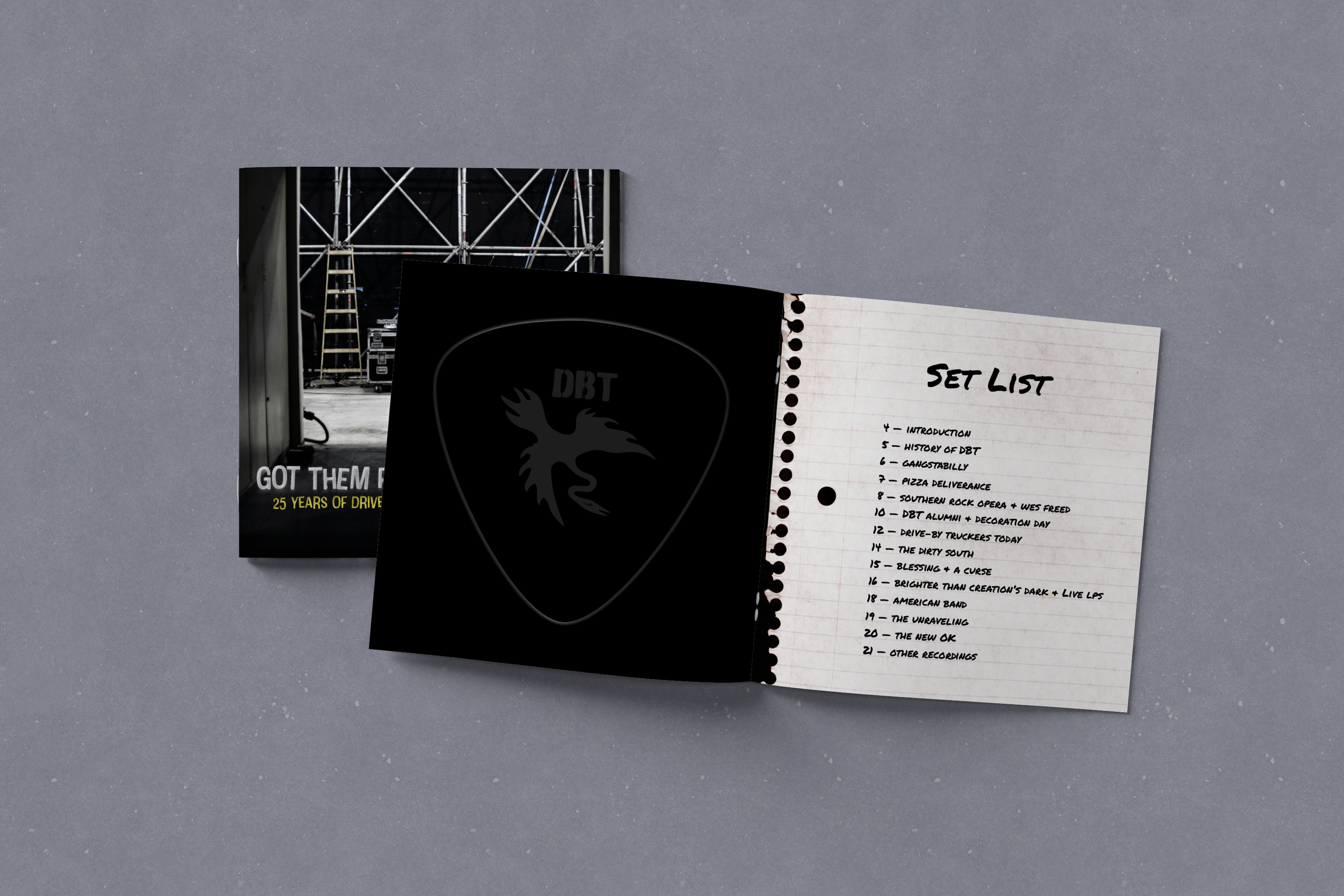
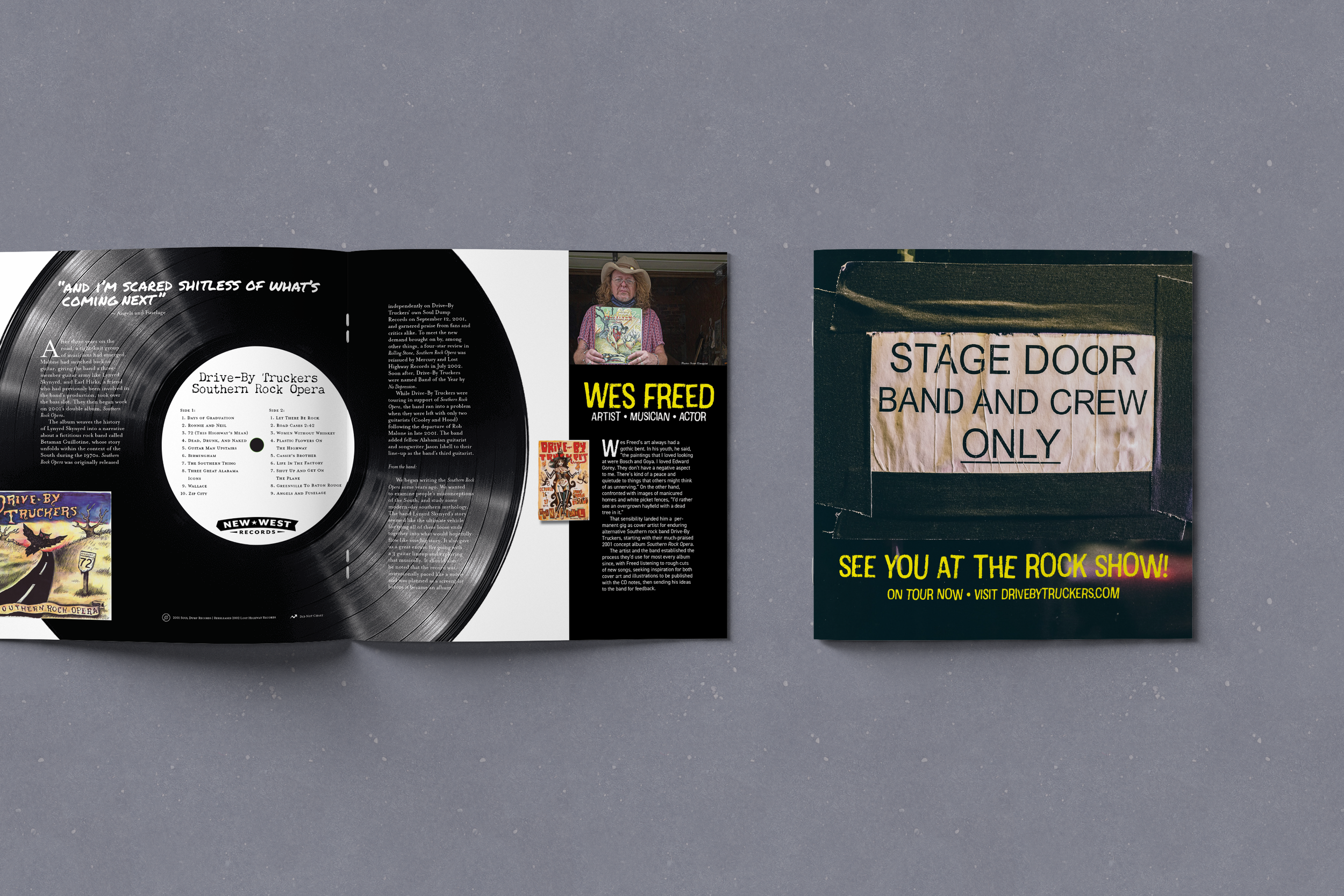
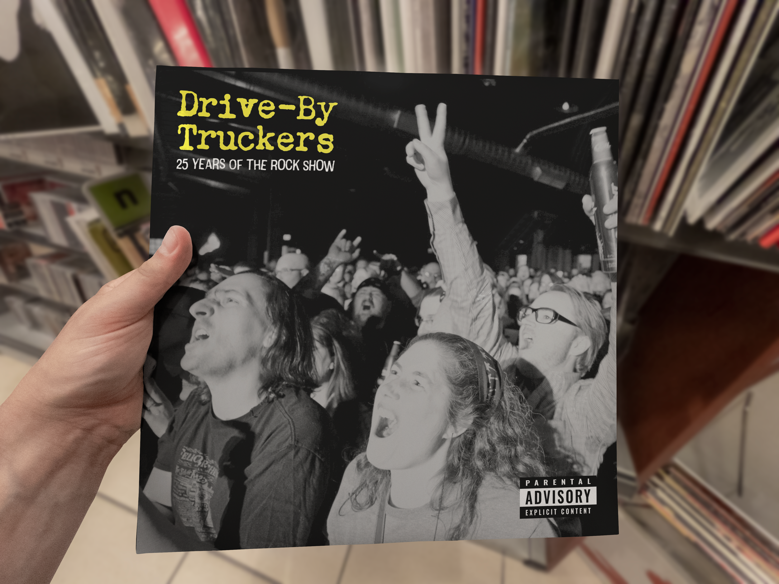
Below you can view selected pages from the booklet that show the different layouts I designed to highlight different categories of information. The typeface for the cover is the display typeface Cotton. I simulated a handwritten set list to construct the table of contents. The body copy throughout the booklet is set in the classic Mrs. Eaves.

Booklet Cover

Inside Front Cover & Table of Contents

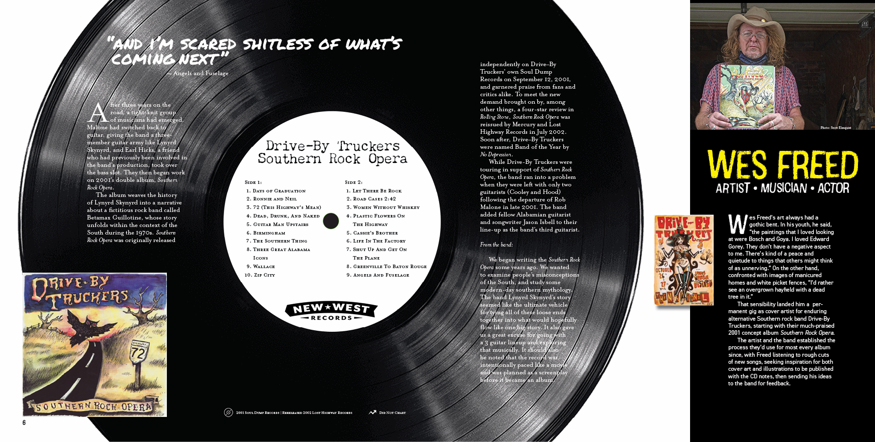
Interior Spread Example
Interior Spread With Sidebar

Interior Spread Example

Credits Page & Inside Back Cover

Back Cover

The Reflection.
This project was a ton of fun and I got to listen to hours of one of my favorite bands to keep the creative inspiration fires burning. My biggest takeaways from this project were to keep scaling back, especially with color usage - simple is most often the best choice. I also learned (often the hard way) about managing large numbers of assets and the importance of clarity in naming conventions and tracking information to properly credit the photographers whose images I used.
I credit this project as cultivating my love of layout design, I hope to do more of this type of work in the future.